Showing statistical significance on seaborn plots with Statannotations
Contents
Showing statistical significance on seaborn plots with Statannotations#
Introduction#
Many libraries are available in Python to clean, analyze, and plot data.
Python also has robust statistical packages which are used by thousands of other projects.
On Github only, statsmodels is used today in more than 44,000 open-source projects, and scipy in more than 350,000 !
(granted, not all for scipy.stats).
That said, if you wish, basically, to add p-values to your plots, with the beautiful brackets as you can see in papers using R or other statistical software, there are not many options.
In this tutorial, we will describe statannotations, a package to add statistical significance annotations on seaborn
categorical plots (v0.4.1).
We will first setup the required tools, then describe the dataset we’ll work on. Then, we’ll learn how to do go from
plots like this,
 to plots like this ↓ !

Specifically, after showing how to install and import statannotations, we will answer the following questions:
How to add custom annotations to a seaborn plot?
How to automatically format previously computed p-values in several different ways, then add these to a plot in a single function call?
How to both perform the statistical tests and add their results to a plot, optionally applying a multiple comparisons correction method?
A subsequent tutorial will cover more advanced features, such as interfacing other statistical tests, multiple comparisons correction methods, and a detailed review of formatting options.
DISCLAIMER: This tutorial aims to describe how to use a plot annotation library, not to teach statistics. The examples are meant only to illustrate the plots, not the statistical methodology, and we will not draw any conclusions about the dataset explored. A correct approach would have required the careful definition of a research question and maybe, ultimately, different group comparisons and/or tests. Of course, the p-value is not the right answer for everything either. This is the topic of many other resources.
Preparing the tools#
First, let’s prepare the tools we’ll need, namely pandas, numpy, pyplot, scipy, and of course seaborn, plus a
few additional functions.
Imports#
!pip install -q -r requirements.txt
^C
import matplotlib.pyplot as plt
import pandas as pd
import seaborn as sns


import numpy as np
from scipy.stats import mannwhitneyu, normaltest
In utils, the folowing functions are implemented:
Pretty-print:
print_n_projects: Prints the number of projects in the passed datasetdescribe_array: Prints a few statistics about the 1D-arrayprint_projects_by: Prints a list of projects, sorted byfuncresult bySubcategory
And these, to reduce repetition for plotting:
get_log_ax: Creates a new pyplot figure, applies a logarithmic scale, an opaque background, and returnsax.label_plot_for_subcats: Adds title and axes labels for plots withSubcategoryasxcoordinatelabel_plot_for_states: Adds title and axes labels for plots withStateasxcoordinateadd_legend: Adds the legend to the plot
Preparing the data#
For this tutorial, we’ll use the Kickstarter dataset “Data for 375,000+ Kickstarter projects from 2009–2017” which includes 374,853 campaigns records, downloaded from https://www.mavenanalytics.io/data-playground.
!pip install wget
import wget
wget.download('https://github.com/trevismd/statannotations-tutorials/raw/main/Tutorial_1/utils.py')
from utils import *
Requirement already satisfied: wget in c:\users\schatzm\anaconda3\envs\julab\lib\site-packages (3.2)
100% [................................................................................] 2114 / 2114
dataset = pd.read_csv('Dataset/kickstarter_projects.csv')
dataset.head()
| ID | Name | Category | Subcategory | Country | Launched | Deadline | Goal | Pledged | Backers | State | |
|---|---|---|---|---|---|---|---|---|---|---|---|
| 0 | 1860890148 | Grace Jones Does Not Give A F$#% T-Shirt (limi... | Fashion | Fashion | United States | 2009-04-21 21:02:48 | 2009-05-31 | 1000 | 625 | 30 | Failed |
| 1 | 709707365 | CRYSTAL ANTLERS UNTITLED MOVIE | Film & Video | Shorts | United States | 2009-04-23 00:07:53 | 2009-07-20 | 80000 | 22 | 3 | Failed |
| 2 | 1703704063 | drawing for dollars | Art | Illustration | United States | 2009-04-24 21:52:03 | 2009-05-03 | 20 | 35 | 3 | Successful |
| 3 | 727286 | Offline Wikipedia iPhone app | Technology | Software | United States | 2009-04-25 17:36:21 | 2009-07-14 | 99 | 145 | 25 | Successful |
| 4 | 1622952265 | Pantshirts | Fashion | Fashion | United States | 2009-04-27 14:10:39 | 2009-05-26 | 1900 | 387 | 10 | Failed |
Campaigns are categorized into categories:
list(dataset.Category.unique())
['Fashion',
 'Film & Video',
 'Art',
 'Technology',
 'Journalism',
 'Publishing',
 'Theater',
 'Music',
 'Photography',
 'Games',
 'Design',
 'Food',
 'Crafts',
 'Comics',
 'Dance']
I like technology, let’s see what’s in there
Exploring the Technology category#
tech = dataset.loc[(dataset.Category=='Technology'), :]
print_n_projects(tech, 'Technology')
print_projects_by(tech, 'ID', 'count')
There are 32562 projects in Technology.
1. Technology           6.93e+03
2. Apps                 6.34e+03
3. Web                  3.91e+03
4. Hardware             3.66e+03
5. Software             3.05e+03
6. Gadgets              2.96e+03
7. Wearables            1.23e+03
8. DIY Electronics      9.02e+02
9. 3D Printing          6.82e+02
10. Sound               6.69e+02
11. Robots              5.72e+02
12. Flight              4.26e+02
13. Camera Equipment    4.16e+02
14. Space Exploration   3.23e+02
15. Fabrication Tools   2.50e+02
16. Makerspaces         2.38e+02
There are over 30,000 projects in Technology. The largest subcategory is also named Technology, with almost
7,000 registered projects, while the smallest, Makerspaces has 238.
Let’s now have a look at the Goal column, representing the campaigns financing objectives in USD.
Total Goal amounts by Subcategory#
# List of tech subcategories, sorted by sum of project Goals
print_projects_by(tech, "Goal", "sum")
1. Technology           1.11e+09
2. Apps                 4.49e+08
3. Web                  4.00e+08
4. Hardware             3.43e+08
5. Software             2.85e+08
6. Space Exploration    1.86e+08
7. Gadgets              1.55e+08
8. Robots               1.07e+08
9. Wearables            7.47e+07
10. Flight              5.93e+07
11. 3D Printing         3.18e+07
12. Sound               3.12e+07
13. Makerspaces         3.11e+07
14. Fabrication Tools   2.90e+07
15. DIY Electronics     1.81e+07
16. Camera Equipment    1.66e+07
D:\USERS_ANALYSIS\Schatzm\GitHub\MB100T01\MB100T01\Statistics\utils.py:23: FutureWarning: The default value of numeric_only in DataFrameGroupBy.sum is deprecated. In a future version, numeric_only will default to False. Either specify numeric_only or select only columns which should be valid for the function.
  grouped_df = (func(df.groupby("Subcategory"))
We can see that the order of Sound(#10), Robots(#11), and Flight (#12) with respect to the total number of
projects is not the same as their order considering total goal amounts which is Robots(#8, +3 positions),
Flight(#10, +2 positions), and Sound(#12, -2 positions).
A closer look to these categories: Robots, Flight, Sound#
For simplicity, we define a subset of the dataset as a new DataFrame named rfs, keeping only the rows belonging to the three
Subcategories.
rfs = tech.loc[(tech.Subcategory.isin(("Robots", "Flight", "Sound"))), :]

print_n_projects(rfs, "rfs")
There are 1667 projects in rfs.
Let’s define colors and orderings for subcategories and states plots
subcat_palette = sns.dark_palette("#8BF", reverse=True, n_colors=5)
states_palette = sns.color_palette("YlGnBu", n_colors=5)

states_order = ["Successful", "Failed", "Live", "Suspended", "Canceled"]
subcat_order = ['Robots', 'Flight', 'Sound']
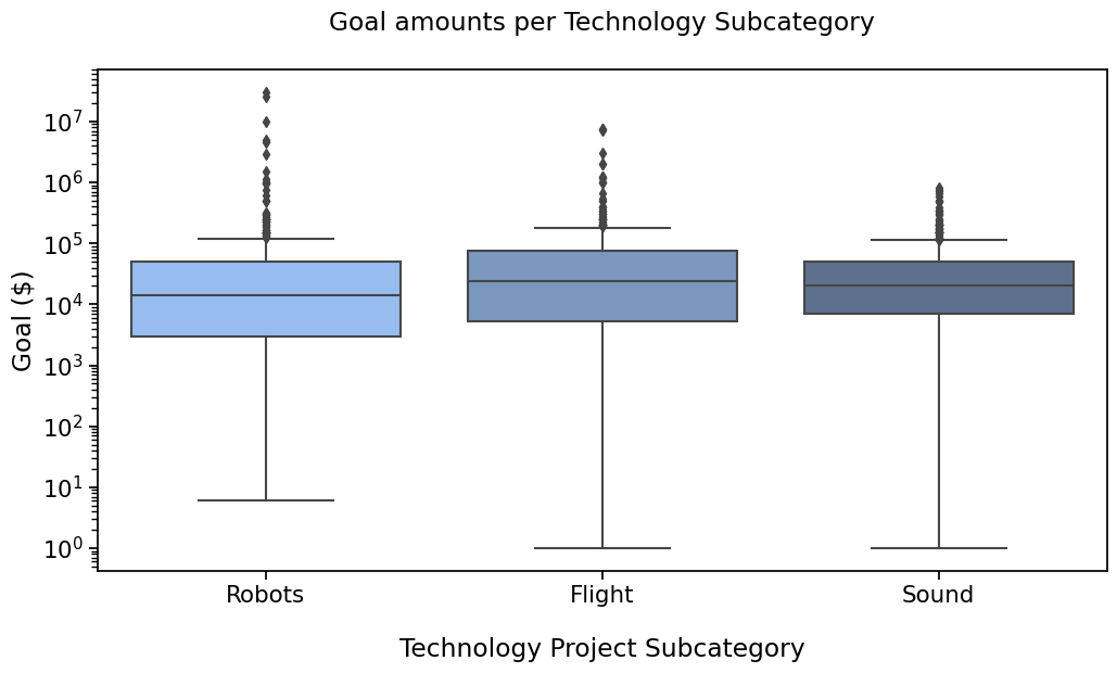
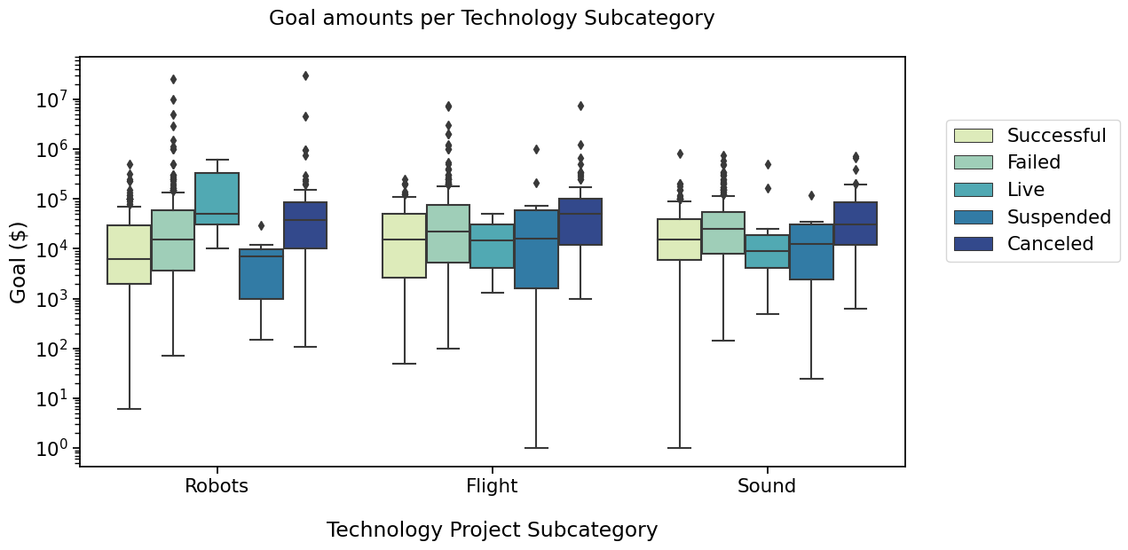
PLOT 1#
with sns.plotting_context("notebook", font_scale=1.4):
    # Create new plot
    ax = get_log_ax()

    sns.boxplot(ax=ax, data=rfs, x='Subcategory', y='Goal', palette=subcat_palette,
                order=subcat_order)

    label_plot_for_subcats(ax)
    plt.savefig("plot1.png", bbox_inches='tight')
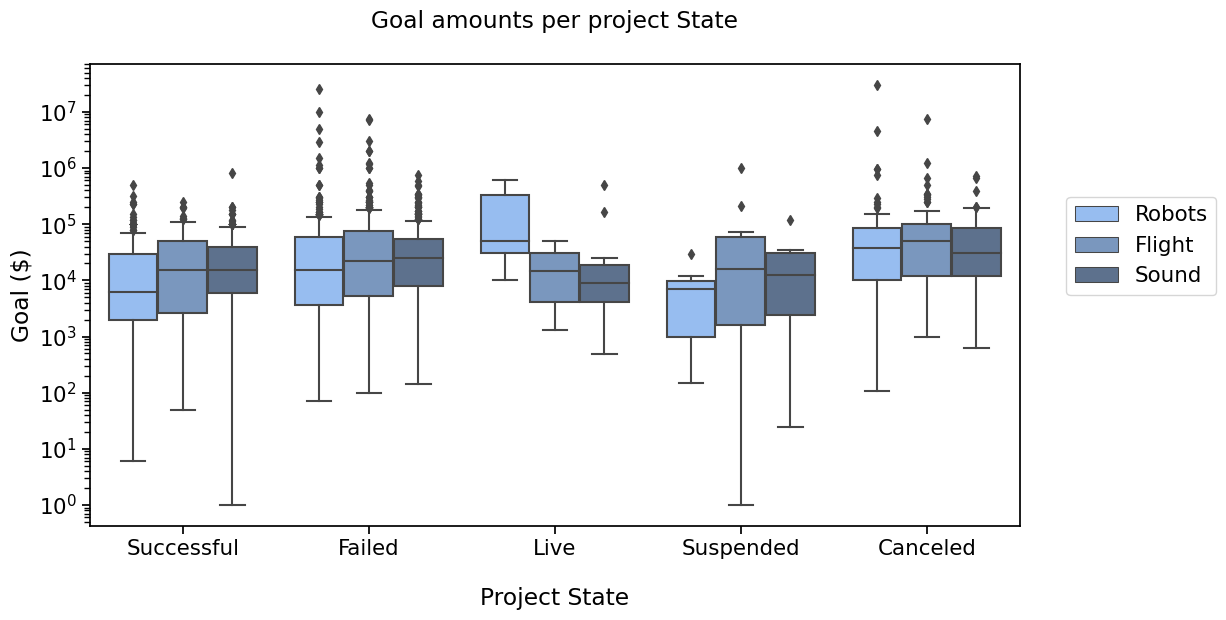
PLOT 2#
with sns.plotting_context("notebook", font_scale=1.4):
    # Create new plot
    ax = get_log_ax()

    # Plot with seaborn
    sns.boxplot(ax=ax, data=rfs, x='State', y='Goal', palette=states_palette,
                order=states_order)

    label_plot_for_states(ax)
    plt.savefig("./plot2.png", bbox_inches='tight')
So, are these values statistically different ?#
Prepare arrays for scipy#
By Subcategory#
robots = rfs.loc[(rfs.Subcategory == "Robots"), "Goal"].values
flight = rfs.loc[(rfs.Subcategory == "Flight"), "Goal"].values
sound = rfs.loc[(rfs.Subcategory == "Sound"), "Goal"].values

log_robots = np.log(robots)
log_flight = np.log(flight)
log_sound = np.log(sound)

describe_array(robots, "Robots")
describe_array(flight, "Flight")
describe_array(sound, "Sound")
print()
describe_array(log_robots, "Log(Robots)")
describe_array(log_flight, "Log(Flight)")
describe_array(log_sound, "Log(Sound)")
"Robots"       Number of projects: 572	Min: 6.00	Max: 3.00e+07	Avg: 187211.62	Median: 1.43e+04
"Flight"       Number of projects: 426	Min: 1.00	Max: 7.50e+06	Avg: 139219.90	Median: 2.40e+04
"Sound"        Number of projects: 669	Min: 1.00	Max: 8.00e+05	Avg: 46710.19	Median: 2.00e+04

"Log(Robots)"  Number of projects: 572	Min: 1.79	Max: 1.72e+01	Avg: 9.42	Median: 9.57e+00
"Log(Flight)"  Number of projects: 426	Min: 0.00	Max: 1.58e+01	Avg: 9.87	Median: 1.01e+01
"Log(Sound)"   Number of projects: 669	Min: 0.00	Max: 1.36e+01	Avg: 9.79	Median: 9.90e+00
Test normality#
from scipy.stats import normaltest, mannwhitneyu
print("Robots: ", normaltest(robots).pvalue)
print("Flight: ", normaltest(flight).pvalue)
print("Sound: ", normaltest(sound).pvalue)
print()
print("Log(robots): ", normaltest(log_robots).pvalue)
print("Log(Flight): ", normaltest(log_flight).pvalue)
print("Log(Sound): ", normaltest(log_sound).pvalue)
Robots:  7.130273714967154e-254
Flight:  2.2950178743850582e-154
Sound:  8.976320746933668e-155

Log(robots):  0.05827453161920078
Log(Flight):  1.9621087718193705e-06
Log(Sound):  8.503743627935909e-22
That’s mostly no, let’s apply Mann Whitney U test
# pvalues with scipy:
stat_results = [mannwhitneyu(robots, flight, alternative="two-sided"),
                mannwhitneyu(flight, sound, alternative="two-sided"),
                mannwhitneyu(robots, sound, alternative="two-sided")]

print("Robots vs Flight: ", stat_results[0])
print("Flight vs Sound: ", stat_results[1])
print("robots vs Sound: ", stat_results[2])

pvalues = [result.pvalue for result in stat_results]
Robots vs Flight:  MannwhitneyuResult(statistic=104646.0, pvalue=0.00013485140468088997)
Flight vs Sound:  MannwhitneyuResult(statistic=148294.5, pvalue=0.2557331102364572)
robots vs Sound:  MannwhitneyuResult(statistic=168156.0, pvalue=0.00022985464929005115)
Remember the first plot

So how to add the statistical significance (pvalues) on there ? There are a few options that you could find, requiring to code quite a few lines. You’ll find them if you look for them.
Instead, I’m going to present you statannotations.
What is Statannotations ?#
Statannotations is an open-source package enabling users to add
statistical significance annotations onto seaborn categorical plots (barplot, boxplot, stripplot, swarmplot,
and violinplot).
It is based on statannot, but now offers a different API.
Installation#
To install statannotations, use pip:
pip install statannotations
Optionally, to use multiple comparisons correction as further down in this tutorial you will also need statsmodels.
pip install statsmodels
Importing the main class#
!pip install statannotations statsmodels
Requirement already satisfied: statannotations in c:\users\schatzm\anaconda3\envs\julab\lib\site-packages (0.5.0)
Requirement already satisfied: statsmodels in c:\users\schatzm\anaconda3\envs\julab\lib\site-packages (0.13.5)
Requirement already satisfied: matplotlib>=2.2.2 in c:\users\schatzm\anaconda3\envs\julab\lib\site-packages (from statannotations) (3.6.2)
Requirement already satisfied: pandas>=0.23.0 in c:\users\schatzm\anaconda3\envs\julab\lib\site-packages (from statannotations) (1.5.2)
Requirement already satisfied: numpy>=1.12.1 in c:\users\schatzm\anaconda3\envs\julab\lib\site-packages (from statannotations) (1.24.1)
Requirement already satisfied: scipy>=1.1.0 in c:\users\schatzm\anaconda3\envs\julab\lib\site-packages (from statannotations) (1.10.0)
Requirement already satisfied: seaborn<0.12,>=0.9.0 in c:\users\schatzm\anaconda3\envs\julab\lib\site-packages (from statannotations) (0.11.2)
Requirement already satisfied: patsy>=0.5.2 in c:\users\schatzm\anaconda3\envs\julab\lib\site-packages (from statsmodels) (0.5.3)
Requirement already satisfied: packaging>=21.3 in c:\users\schatzm\anaconda3\envs\julab\lib\site-packages (from statsmodels) (22.0)
Requirement already satisfied: contourpy>=1.0.1 in c:\users\schatzm\anaconda3\envs\julab\lib\site-packages (from matplotlib>=2.2.2->statannotations) (1.0.6)
Requirement already satisfied: pillow>=6.2.0 in c:\users\schatzm\anaconda3\envs\julab\lib\site-packages (from matplotlib>=2.2.2->statannotations) (9.4.0)
Requirement already satisfied: cycler>=0.10 in c:\users\schatzm\anaconda3\envs\julab\lib\site-packages (from matplotlib>=2.2.2->statannotations) (0.11.0)
Requirement already satisfied: kiwisolver>=1.0.1 in c:\users\schatzm\anaconda3\envs\julab\lib\site-packages (from matplotlib>=2.2.2->statannotations) (1.4.4)
Requirement already satisfied: python-dateutil>=2.7 in c:\users\schatzm\anaconda3\envs\julab\lib\site-packages (from matplotlib>=2.2.2->statannotations) (2.8.2)
Requirement already satisfied: fonttools>=4.22.0 in c:\users\schatzm\anaconda3\envs\julab\lib\site-packages (from matplotlib>=2.2.2->statannotations) (4.38.0)
Requirement already satisfied: pyparsing>=2.2.1 in c:\users\schatzm\anaconda3\envs\julab\lib\site-packages (from matplotlib>=2.2.2->statannotations) (3.0.9)
Requirement already satisfied: pytz>=2020.1 in c:\users\schatzm\anaconda3\envs\julab\lib\site-packages (from pandas>=0.23.0->statannotations) (2022.7)
Requirement already satisfied: six in c:\users\schatzm\anaconda3\envs\julab\lib\site-packages (from patsy>=0.5.2->statsmodels) (1.16.0)
from statannotations.Annotator import Annotator
Use statannotations#
The general pattern is 0. Decide which pairs of data you would like to annotate
Instantiate an
Annotator(or reuse it on a new plot, we’ll cover that later)Configure it (text formatting, statistical test, multiple comparisons correction method…)
Make the annotations (we’ll cover these cases)
By providing completely custom annotations (A)
By providing pvalues to be formatted before being added to the plot (B)
By applying a configured test (C)
Annotate !
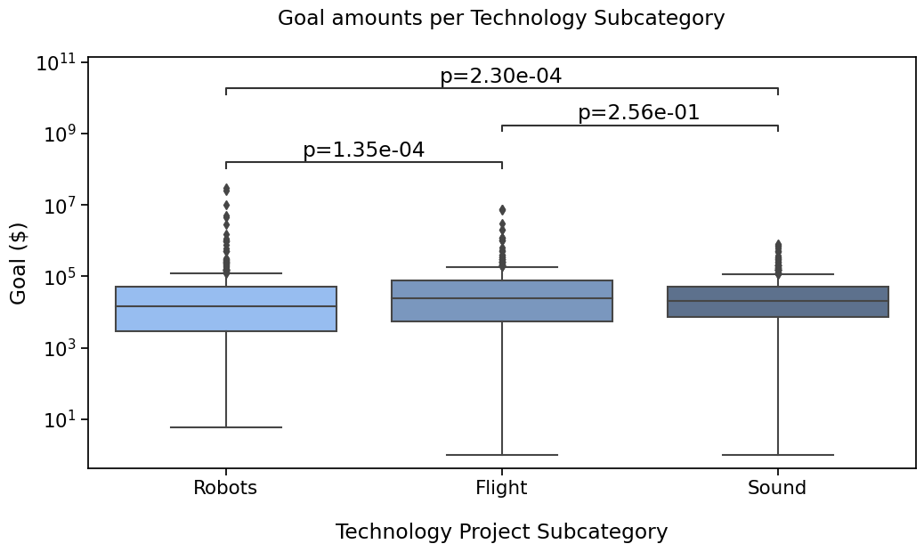
A - Add any text, such as previously calculated results#
If we already have a seaborn plot (and its associated ax), and statistical results, or any other text we would like to
display on the plot, these are the detailed steps required.
STEP 0: What to compare
A pre-requisite to annotating the plot, is deciding which pairs you are comparing.
You’ll pass which boxes (or bars, violins, etc) you want to annotate in a pairs parameter. In this case, it is the
equivalent of 'Robots vs Flight' and others.
For statannotations, we specify this as a list of tuples like ('Robots', 'Flight')
pairs = [('Robots', 'Flight'),  # 'Robots' vs 'Flight'
             ('Flight', 'Sound'),   # 'Flight' vs 'Sound'
             ('Robots', 'Sound')]   # 'Robots' vs 'Sound'
STEP 1: The annotator
We now have all we need to instantiate the annotator
annotator = Annotator(ax, pairs, ...) # With ... = all parameters passed to seaborn's plotter
STEP 2: In this first example, we will not configure anything.
STEP 3: We’ll then add the raw pvalues from scipy’s returned values
pvalues = [sci_stats.mannwhitneyu(robots, flight, alternative="two-sided").pvalue,
           sci_stats.mannwhitneyu(flight, sound, alternative="two-sided").pvalue,
           sci_stats.mannwhitneyu(robots, sound, alternative="two-sided").pvalue]
using
annotator.set_custom_annotations(pvalues)
STEP 4: Annotate !
annotator.annotate()
(*) Make sure pairs and annotations (pvalues here) are in the same order
# Putting the parameters in a dictionary avoids code duplication
# since we use the same for `sns.boxplot` and `Annotator` calls
plotting_parameters = {
    'data':    rfs,
    'x':       'Subcategory',
    'y':       'Goal',
    'order':   subcat_order,
    'palette': subcat_palette,
}

pairs = [('Robots', 'Flight'),
         ('Flight', 'Sound'),
         ('Robots', 'Sound')]

formatted_pvalues = [f"p={p:.2e}" for p in pvalues]

with sns.plotting_context('notebook', font_scale=1.4):
    # Create new plot
    ax = get_log_ax()

    # Plot with seaborn
    sns.boxplot(**plotting_parameters)

    # Add annotations
    annotator = Annotator(ax, pairs, **plotting_parameters)
    annotator.set_custom_annotations(formatted_pvalues)
    annotator.annotate()

    # Label and show
    label_plot_for_subcats(ax)
    plt.savefig("./plot1A.png", bbox_inches='tight')
    plt.show()
p-value annotation legend:
ns: p <= 1.00e+00
*: 1.00e-02 < p <= 5.00e-02
**: 1.00e-03 < p <= 1.00e-02
***: 1.00e-04 < p <= 1.00e-03
****: p <= 1.00e-04
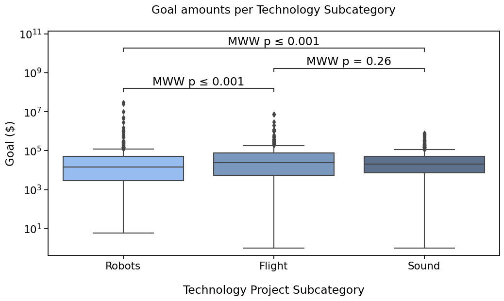
Robots vs. Flight: p=1.35e-04
Flight vs. Sound: p=2.56e-01
Robots vs. Sound: p=2.30e-04
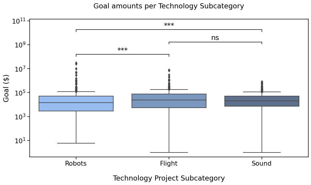
B - Let’s automatically format these pvalues for prettier result#
We will use set_pvalues instead of set_custom_annotations to benefit from formatting options
With the star notation (default)#
with sns.plotting_context("notebook", font_scale=1.4):
    # Create new plot
    ax = get_log_ax()

    # Plot with seaborn
    sns.boxplot(ax=ax, **plotting_parameters)

    # Add annotations
    annotator = Annotator(ax, pairs, **plotting_parameters)
    annotator.set_pvalues(pvalues)
    annotator.annotate()

    # Label and show
    label_plot_for_subcats(ax)
    plt.show()
p-value annotation legend:
ns: p <= 1.00e+00
*: 1.00e-02 < p <= 5.00e-02
**: 1.00e-03 < p <= 1.00e-02
***: 1.00e-04 < p <= 1.00e-03
****: p <= 1.00e-04
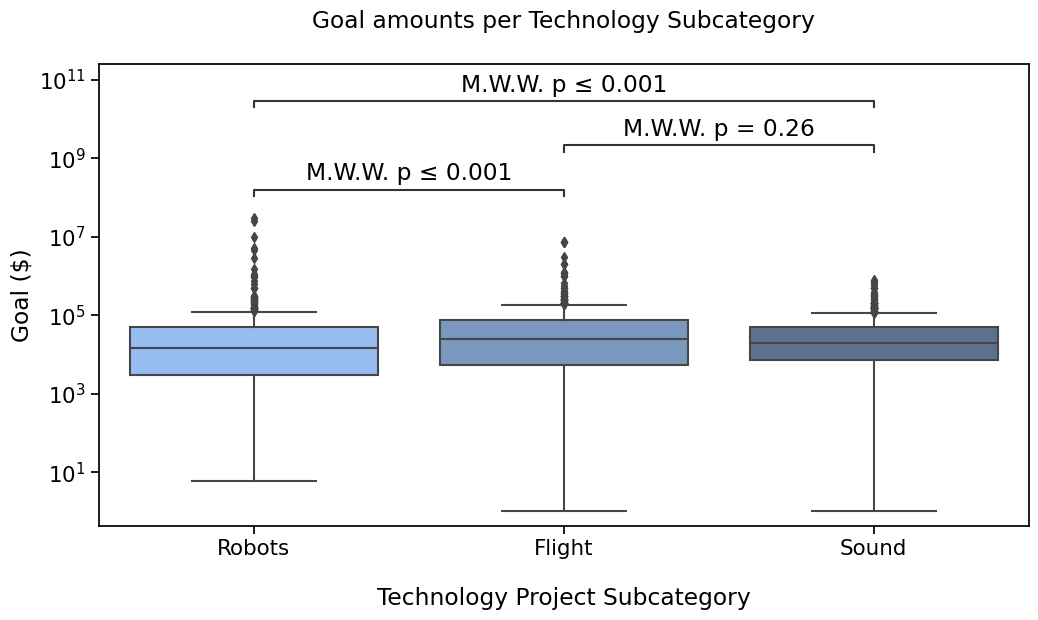
Robots vs. Flight: Custom statistical test, P_val:1.349e-04
Flight vs. Sound: Custom statistical test, P_val:2.557e-01
Robots vs. Sound: Custom statistical test, P_val:2.299e-04
With a simple format to display significance#
In this case, we will configure text_format to simple to show a summary of pvalues.
with sns.plotting_context("notebook", font_scale=1.4):
    # Create new plot
    ax = get_log_ax()

    # Plot with seaborn
    sns.boxplot(ax=ax, **plotting_parameters)

    # Add annotations
    annotator = Annotator(ax, pairs, **plotting_parameters)
    annotator.configure(text_format="simple")
    annotator.set_pvalues(pvalues).annotate()

    # Label and show
    label_plot_for_subcats(ax)
    plt.show()
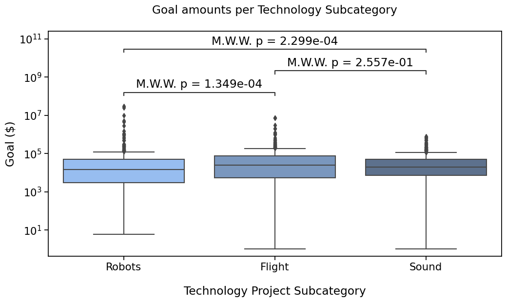
Robots vs. Flight: Custom statistical test, P_val:1.349e-04
Flight vs. Sound: Custom statistical test, P_val:2.557e-01
Robots vs. Sound: Custom statistical test, P_val:2.299e-04

We can also provide a test_short_name parameter to be displayed right before the pvalue.
I’ll also show how to reduce the code needed a bit more by reusing the annotator instance,
since we are not changing the data and pairs. This will also remember our text_format option configured.
with sns.plotting_context("notebook", font_scale=1.4):
    # Create new plot
    ax = get_log_ax()

    # Plot with seaborn
    sns.boxplot(ax=ax, **plotting_parameters)

    # Add annotations
    annotator.new_plot(ax, **plotting_parameters)  # Same pairs and data, we can keep the annotator
    annotator.configure(test_short_name="MWW")     # text_format is still simple
    annotator.set_pvalues_and_annotate(pvalues)    # in one function call

    # Label and show
    label_plot_for_subcats(ax)
    plt.show()
Robots vs. Flight: Custom statistical test, P_val:1.349e-04
Flight vs. Sound: Custom statistical test, P_val:2.557e-01
Robots vs. Sound: Custom statistical test, P_val:2.299e-04
Tweak the layout#
I would like to see more space between the annotations and the text.
The annotate method allows to parameters to do just that
with sns.plotting_context("notebook", font_scale=1.4):
    # Create new plot
    ax = get_log_ax()

    # Plot with seaborn
    sns.boxplot(ax=ax, **plotting_parameters)

    # Add annotations
    annotator.new_plot(ax, **plotting_parameters)    # Same pairs and data, we can keep the annotator
    annotator.configure(text_offset=3, verbose=0)  # Disabling printed output as it is the same
    annotator.set_pvalues(pvalues)                   # Now, test_short_name is also remembered
    annotator.annotate()

    # Label and show
    label_plot_for_subcats(ax)
    plt.show()

Use statannotations to apply scipy test#
Finally, statannotations can take care of most of the steps required to run the test by calling scipy.stats directly
and annotate the plot.
The available options are
Mann-Whitney
t-test (independent and paired)
Welch’s t-test
Levene test
Wilcoxon test
Kruskal-Wallis test
In the next tutorial, I’ll cover how to use a test that is not one of those already interfaced in statannotations.
If you are curious, you can also take a look at the usage
notebook in the project repository.
with sns.plotting_context('notebook', font_scale=1.4):
    # Create new plot
    ax = get_log_ax()

    # Plot with seaborn
    sns.boxplot(ax=ax, **plotting_parameters)

    # Add annotations
    annotator.new_plot(ax, pairs=pairs, **plotting_parameters)
    annotator.configure(test='Mann-Whitney', verbose=True).apply_and_annotate()

    # Label and show
    label_plot_for_subcats(ax)
    plt.show()
Robots vs. Flight: Mann-Whitney-Wilcoxon test two-sided, P_val:1.349e-04 U_stat=1.046e+05
Flight vs. Sound: Mann-Whitney-Wilcoxon test two-sided, P_val:2.557e-01 U_stat=1.483e+05
Robots vs. Sound: Mann-Whitney-Wilcoxon test two-sided, P_val:2.299e-04 U_stat=1.682e+05
There is also the "full" format for annotations
with sns.plotting_context("notebook", font_scale=1.4):
    # Create new plot
    ax = get_log_ax()

    # Plot with seaborn
    sns.boxplot(ax=ax, **plotting_parameters)

    # Add annotations
    annotator.new_plot(ax, **plotting_parameters)
    annotator.configure(text_format="full", verbose=False).apply_and_annotate()

    # Label and show
    label_plot_for_subcats(ax)
    plt.show()
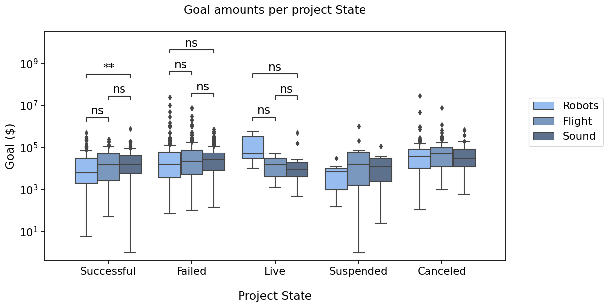
And that plot by State ?#

Say we’re interested in comparing ‘Successful’, ‘Failed’, ‘Cancelled’ and ‘Live’ states
values = rfs.loc[(rfs.State == "Successful"), "Goal"].values
describe_array(values, "Successful", 18)
print(normaltest(values), "\n")

log_values = np.log(rfs.loc[(rfs.State == "Successful"), "Goal"].values)
describe_array(values, "Log(Successful)", 18)
print(normaltest(log_values))
"Successful"      Number of projects: 576	Min: 1.00	Max: 8.00e+05	Avg: 31438.18	Median: 1.38e+04
NormaltestResult(statistic=756.6903519347284, pvalue=4.8615843204626055e-165)

"Log(Successful)" Number of projects: 576	Min: 1.00	Max: 8.00e+05	Avg: 31438.18	Median: 1.38e+04
NormaltestResult(statistic=56.79986477039819, pvalue=4.635174393791566e-13)
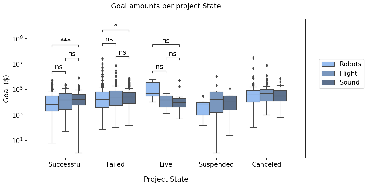
We will need to define the new pairs to compare, then apply the same method to configure, get test results and annotate the plot.
pairs = [
    ("Successful", "Failed"),
    ("Successful", "Live"),
    ("Failed", "Live"),
    ("Canceled", "Successful"),
    ("Canceled", "Failed"),
    ("Canceled", "Live"),
]

state_plot_params = {
    'data': rfs,
    'x': 'State',
    'y': 'Goal',
    'order': states_order,
    'palette': states_palette
}

with sns.plotting_context('notebook', font_scale=1.4):
    # Create new plot
    ax = get_log_ax()

    # Plot with seaborn
    sns.boxplot(ax=ax, **state_plot_params)

    # Add annotations
    annotator = Annotator(ax, pairs, **state_plot_params)
    annotator.configure(test='Mann-Whitney').apply_and_annotate()

    # Label and show
    label_plot_for_states(ax)
    plt.savefig("./plot2C.png", bbox_inches="tight")
    plt.show()
p-value annotation legend:
      ns: p <= 1.00e+00
       *: 1.00e-02 < p <= 5.00e-02
      **: 1.00e-03 < p <= 1.00e-02
     ***: 1.00e-04 < p <= 1.00e-03
    ****: p <= 1.00e-04

Successful vs. Failed: Mann-Whitney-Wilcoxon test two-sided, P_val:2.813e-08 U_stat=1.962e+05
Failed vs. Live: Mann-Whitney-Wilcoxon test two-sided, P_val:2.511e-01 U_stat=9.932e+03
Successful vs. Live: Mann-Whitney-Wilcoxon test two-sided, P_val:9.215e-01 U_stat=5.971e+03
Live vs. Canceled: Mann-Whitney-Wilcoxon test two-sided, P_val:6.641e-03 U_stat=1.460e+03
Failed vs. Canceled: Mann-Whitney-Wilcoxon test two-sided, P_val:1.423e-05 U_stat=7.239e+04
Successful vs. Canceled: Mann-Whitney-Wilcoxon test two-sided, P_val:4.054e-16 U_stat=3.910e+04
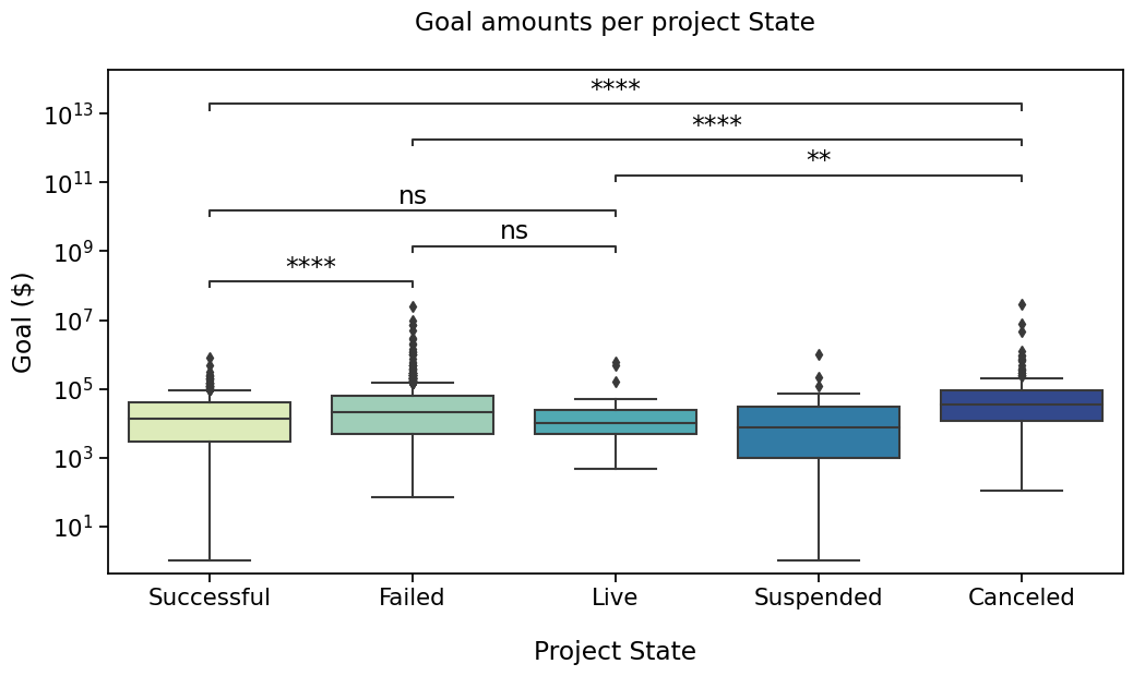
Now, that’s a pretty plot !
If you are worried about multiple testing and correction methods, read on !
But first, let’s see what happends with two levels of categorization, box plots with hue.
Boxplots with hue#
We are also going to work on these two plots of the same data
PLOT 3#
#@title
with sns.plotting_context('notebook', font_scale=1.4):
    # Create new plot
    ax = get_log_ax()

    # Plot with seaborn
    ax = sns.boxplot(ax=ax,
                     data=rfs,
                     x='Subcategory', y='Goal',
                     order=subcat_order,
                     hue="State",
                     hue_order=states_order,
                     palette=states_palette)

    # Label and show
    add_legend(ax)
    label_plot_for_subcats(ax)
    plt.show()
I’d like to compare “Successful” and “Failed” and “Live” states in the 3 subcategories. Box pairs must then contain the information about the subcategory and the state, and are defined as below
pairs = [
    [('Robots', 'Successful'), ('Robots', 'Failed')],
    [('Flight', 'Successful'), ('Flight', 'Failed')],
    [('Sound', 'Successful'), ('Sound', 'Failed')],

    [('Robots', 'Successful'), ('Robots', 'Live')],
    [('Flight', 'Successful'), ('Flight', 'Live')],
    [('Sound', 'Successful'), ('Sound', 'Live')],

    [('Robots', 'Failed'), ('Robots', 'Live')],
    [('Flight', 'Failed'), ('Flight', 'Live')],
    [('Sound', 'Failed'), ('Sound', 'Live')],
]
again, putting plot parameters in a dictionary so that we can use it twice, then using the Annotator
hue_plot_params = {
    'data': rfs,
    'x': 'Subcategory',
    'y': 'Goal',
    "order": subcat_order,
    "hue": "State",
    "hue_order": states_order,
    "palette": states_palette
}

with sns.plotting_context("notebook", font_scale=1.4):
    # Create new plot
    ax = get_log_ax()

    # Plot with seaborn
    ax = sns.boxplot(ax=ax, **hue_plot_params)

    # Add annotations
    annotator = Annotator(ax, pairs, **hue_plot_params)
    annotator.configure(test="Mann-Whitney").apply_and_annotate()

    # Label and show
    add_legend(ax)
    label_plot_for_subcats(ax)
    plt.show()
p-value annotation legend:
      ns: p <= 1.00e+00
       *: 1.00e-02 < p <= 5.00e-02
      **: 1.00e-03 < p <= 1.00e-02
     ***: 1.00e-04 < p <= 1.00e-03
    ****: p <= 1.00e-04

Sound_Failed vs. Sound_Live: Mann-Whitney-Wilcoxon test two-sided, P_val:5.311e-02 U_stat=2.534e+03
Robots_Successful vs. Robots_Failed: Mann-Whitney-Wilcoxon test two-sided, P_val:1.435e-04 U_stat=2.447e+04
Robots_Failed vs. Robots_Live: Mann-Whitney-Wilcoxon test two-sided, P_val:2.393e-01 U_stat=2.445e+02
Flight_Successful vs. Flight_Failed: Mann-Whitney-Wilcoxon test two-sided, P_val:4.658e-02 U_stat=8.990e+03
Flight_Failed vs. Flight_Live: Mann-Whitney-Wilcoxon test two-sided, P_val:4.185e-01 U_stat=6.875e+02
Sound_Successful vs. Sound_Failed: Mann-Whitney-Wilcoxon test two-sided, P_val:1.222e-03 U_stat=3.191e+04
Robots_Successful vs. Robots_Live: Mann-Whitney-Wilcoxon test two-sided, P_val:8.216e-02 U_stat=1.405e+02
Flight_Successful vs. Flight_Live: Mann-Whitney-Wilcoxon test two-sided, P_val:7.825e-01 U_stat=1.650e+02
Sound_Successful vs. Sound_Live: Mann-Whitney-Wilcoxon test two-sided, P_val:2.220e-01 U_stat=2.290e+03
PLOT 4#
To compare the states, across categories, let’s plot it differently
# Switching hue and x
hue_plot_params = {
    'data':      rfs,
    'x':         'State',
    'y':         'Goal',
    "order":     states_order,
    "hue":       "Subcategory",
    "hue_order": subcat_order,
    "palette":   subcat_palette
}

with sns.plotting_context("notebook", font_scale=1.4):
    # Create new plot
    ax = get_log_ax()

    # Plot with seaborn
    ax = sns.boxplot(ax=ax, **hue_plot_params)

    # Label and show
    add_legend(ax)
    label_plot_for_states(ax)
    plt.show()
pairs =(
    [('Successful', 'Robots'), ('Successful', 'Flight')],
    [('Successful', 'Flight'), ('Successful', 'Sound')],
    [('Successful', 'Robots'), ('Successful', 'Sound')],

    [('Failed', 'Robots'), ('Failed', 'Flight')],
    [('Failed', 'Flight'), ('Failed', 'Sound')],
    [('Failed', 'Robots'), ('Failed', 'Sound')],

    [('Live', 'Robots'), ('Live', 'Flight')],
    [('Live', 'Flight'), ('Live', 'Sound')],
    [('Live', 'Robots'), ('Live', 'Sound')],
)

with sns.plotting_context("notebook", font_scale=1.4):
    # Create new plot
    ax = get_log_ax()

    # Plot with seaborn
    ax = sns.boxplot(ax=ax, **hue_plot_params)

    # Add annotations
    annotator = Annotator(ax, pairs, **hue_plot_params)
    annotator.configure(test="Mann-Whitney", verbose=False)
    _, results = annotator.apply_and_annotate()

    # Label and show
    add_legend(ax)
    label_plot_for_states(ax)
    plt.show()
Now again, that is a lot of tests. If one would like to apply a multiple testing correction method, it is possible.
Correcting for multiple testing (introduction)#
In this section, I will quickly demonstrate how to use one of the readily available interfaces. More advanced uses will be described in the following tutorial.
Basically, you can use the comparisons_correction parameter for the .configure method, for one of the following
correction methods (as implemented by statsmodels)
Bonferroni (“bonf”)
Benjamini-Hochberg (“BH”)
Holm-Bonferroni (“HB”)
Benjamini-Yekutieli (“BY”)
with sns.plotting_context("notebook", font_scale=1.4):
    # Create new plot
    ax = get_log_ax()

    # Plot with seaborn
    ax = sns.boxplot(ax=ax, **hue_plot_params)

    # Add annotations
    annotator = Annotator(ax, pairs, **hue_plot_params)
    annotator.configure(test="Mann-Whitney", comparisons_correction="bonferroni")
    _, corrected_results = annotator.apply_and_annotate()

    # Label and show
    add_legend(ax)
    label_plot_for_states(ax)
    plt.show()
p-value annotation legend:
      ns: p <= 1.00e+00
       *: 1.00e-02 < p <= 5.00e-02
      **: 1.00e-03 < p <= 1.00e-02
     ***: 1.00e-04 < p <= 1.00e-03
    ****: p <= 1.00e-04

Failed_Flight vs. Failed_Sound: Mann-Whitney-Wilcoxon test two-sided with Bonferroni correction, P_val:1.000e+00 U_stat=3.803e+04
Live_Robots vs. Live_Flight: Mann-Whitney-Wilcoxon test two-sided with Bonferroni correction, P_val:1.000e+00 U_stat=9.500e+00
Live_Flight vs. Live_Sound: Mann-Whitney-Wilcoxon test two-sided with Bonferroni correction, P_val:1.000e+00 U_stat=2.900e+01
Successful_Robots vs. Successful_Flight: Mann-Whitney-Wilcoxon test two-sided with Bonferroni correction, P_val:8.862e-01 U_stat=7.500e+03
Successful_Flight vs. Successful_Sound: Mann-Whitney-Wilcoxon test two-sided with Bonferroni correction, P_val:1.000e+00 U_stat=1.013e+04
Failed_Robots vs. Failed_Flight: Mann-Whitney-Wilcoxon test two-sided with Bonferroni correction, P_val:8.298e-01 U_stat=3.441e+04
Live_Robots vs. Live_Sound: Mann-Whitney-Wilcoxon test two-sided with Bonferroni correction, P_val:1.000e+00 U_stat=3.400e+01
Failed_Robots vs. Failed_Sound: Mann-Whitney-Wilcoxon test two-sided with Bonferroni correction, P_val:3.771e-01 U_stat=3.364e+04
Successful_Robots vs. Successful_Sound: Mann-Whitney-Wilcoxon test two-sided with Bonferroni correction, P_val:1.504e-03 U_stat=2.491e+04
Which didn’t change the conclusion in this case, but as you can see, the pvalues were corrected
for result, corrected_result in zip(results, corrected_results):
    print(f"{result.data.pvalue:.2e} => {corrected_result.data.pvalue:.2e}")
8.04e-01 => 1.00e+00
2.85e-01 => 1.00e+00
9.59e-01 => 1.00e+00
9.85e-02 => 8.86e-01
7.23e-01 => 1.00e+00
9.22e-02 => 8.30e-01
1.21e-01 => 1.00e+00
4.19e-02 => 3.77e-01
1.67e-04 => 1.50e-03
So the difference in goal amounts for Failed Robots and Sound projects went from about 0.04 to about 0.4 (the
one before last in previous list), and is no longer considered statistically significant with the default alpha of
0.05.
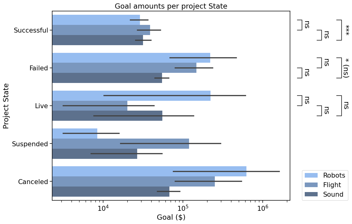
Bonus#
Other types of plots are supported. Here is the same plot with barplot, and other tweaked parameters
hue_plot_params = {**hue_plot_params, 'x':  'Goal','y': 'State','dodge': True, 'orient': 'h'}

with sns.plotting_context("notebook", font_scale=1.4):
    # Create new plot
    ax = get_log_ax('h')

    # Plot with seaborn
    ax = sns.barplot(ax=ax, **hue_plot_params)

    # Add annotations
    annotator = Annotator(ax, pairs, plot='barplot', **hue_plot_params)
    annotator.configure(test="Mann-Whitney", comparisons_correction="BH",
                        verbose=False, loc="outside").apply_and_annotate()

    # Label and show
    ax.set_xlabel("Goal ($)")
    ax.set_ylabel("Project State")
    plt.title("Goal amounts per project State")
    ax.legend(loc=(1.05, 0))
    plt.show()
Conclusion#
Congratulations on reaching the end of this tutorial. In this post, we covered several use cases for an Annotator, from using custom labels to having the package apply statistical tests, all with several formatting options. This should cover many use cases already, but you may want to wait for the next part to discover more features.
What’s next?#
In the following tutorial, we will see how we can:
Annotate different kinds of plots
Use other functions for statistical tests and multiple comparisons correction which are not already available in the library, with minimal extra code
Further customize the p-values format within the annotations text_format options
Adjust the spacing between annotations and/or position them outside the plotting area
Use the other outputs
Acknowledgements#
Statannotations is a collaborative work since its early days. A great deal was done in the statannot package before I contributed to it for the first time two years ago, and it was very gratifying to be a part of it.
The Jupyter to Medium and Junix packages were very helpful resources to reduce the load of turning the notebook into an article. You should check them out if you need to export your notebooks.
from watermark import watermark
watermark(iversions=True, globals_=globals())
print(watermark())
print(watermark(packages="watermark,numpy,scipy,pandas,matplotlib,seaborn,statannotations"))
Last updated: 2023-01-05T13:30:59.175423+01:00

Python implementation: CPython
Python version       : 3.9.15
IPython version      : 8.8.0

Compiler    : MSC v.1929 64 bit (AMD64)
OS          : Windows
Release     : 10
Machine     : AMD64
Processor   : Intel64 Family 6 Model 85 Stepping 7, GenuineIntel
CPU cores   : 40
Architecture: 64bit

watermark      : 2.3.1
numpy          : 1.24.1
scipy          : 1.10.0
pandas         : 1.5.2
matplotlib     : 3.6.2
seaborn        : 0.11.2
statannotations: 0.5.0