Visualizing distributions of data
Contents
Visualizing distributions of data#
An early step in any effort to analyze or model data should be to understand how the variables are distributed. Techniques for distribution visualization can provide quick answers to many important questions. What range do the observations cover? What is their central tendency? Are they heavily skewed in one direction? Is there evidence for bimodality? Are there significant outliers? Do the answers to these questions vary across subsets defined by other variables?
The :ref:distributions module <distribution_api> contains several functions designed to answer questions such as these. The axes-level functions are :func:histplot, :func:kdeplot, :func:ecdfplot, and :func:rugplot. They are grouped together within the figure-level :func:displot, :func:jointplot, and :func:pairplot functions.
There are several different approaches to visualizing a distribution, and each has its relative advantages and drawbacks. It is important to understand these factors so that you can choose the best approach for your particular aim.
!pip install -q -r requirements.txt
%matplotlib inline
import seaborn as sns; sns.set_theme()
Plotting univariate histograms#
Perhaps the most common approach to visualizing a distribution is the histogram. This is the default approach in :func:displot, which uses the same underlying code as :func:histplot. A histogram is a bar plot where the axis representing the data variable is divided into a set of discrete bins and the count of observations falling within each bin is shown using the height of the corresponding bar:
penguins = sns.load_dataset("penguins")
sns.displot(penguins, x="flipper_length_mm")
<seaborn.axisgrid.FacetGrid at 0x1ec36f96390>
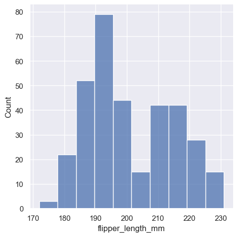
This plot immediately affords a few insights about the flipper_length_mm variable. For instance, we can see that the most common flipper length is about 195 mm, but the distribution appears bimodal, so this one number does not represent the data well.
###Choosing the bin size
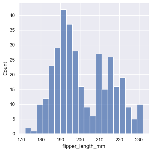
The size of the bins is an important parameter, and using the wrong bin size can mislead by obscuring important features of the data or by creating apparent features out of random variability. By default, :func:displot/:func:histplot choose a default bin size based on the variance of the data and the number of observations. But you should not be over-reliant on such automatic approaches, because they depend on particular assumptions about the structure of your data. It is always advisable to check that your impressions of the distribution are consistent across different bin sizes. To choose the size directly, set the binwidth parameter:
sns.displot(penguins, x="flipper_length_mm", binwidth=3)
<seaborn.axisgrid.FacetGrid at 0x1ec1846ce10>
In other circumstances, it may make more sense to specify the number of bins, rather than their size:
sns.displot(penguins, x="flipper_length_mm", bins=20)
<seaborn.axisgrid.FacetGrid at 0x1ec1a5d2a10>

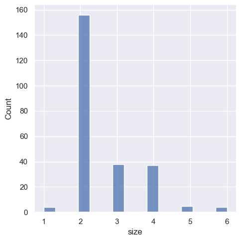
One example of a situation where defaults fail is when the variable takes a relatively small number of integer values. In that case, the default bin width may be too small, creating awkward gaps in the distribution:
tips = sns.load_dataset("tips")
sns.displot(tips, x="size")
<seaborn.axisgrid.FacetGrid at 0x1ec184aac10>
One approach would be to specify the precise bin breaks by passing an array to bins:
sns.displot(tips, x="size", bins=[1, 2, 3, 4, 5, 6, 7])
<seaborn.axisgrid.FacetGrid at 0x1ec1a6f84d0>

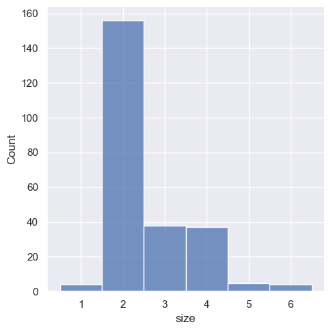
This can also be accomplished by setting discrete=True, which chooses bin breaks that represent the unique values in a dataset with bars that are centered on their corresponding value.
sns.displot(tips, x="size", discrete=True)
<seaborn.axisgrid.FacetGrid at 0x1ec1b76cf50>
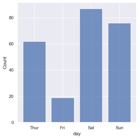
It’s also possible to visualize the distribution of a categorical variable using the logic of a histogram. Discrete bins are automatically set for categorical variables, but it may also be helpful to “shrink” the bars slightly to emphasize the categorical nature of the axis:
sns.displot(tips, x="day", shrink=.8)
<seaborn.axisgrid.FacetGrid at 0x1ec18440750>
Conditioning on other variables#
Once you understand the distribution of a variable, the next step is often to ask whether features of that distribution differ across other variables in the dataset. For example, what accounts for the bimodal distribution of flipper lengths that we saw above? :func:displot and :func:histplot provide support for conditional subsetting via the hue semantic. Assigning a variable to hue will draw a separate histogram for each of its unique values and distinguish them by color:
sns.displot(penguins, x="flipper_length_mm", hue="species")
<seaborn.axisgrid.FacetGrid at 0x1ec1b874590>
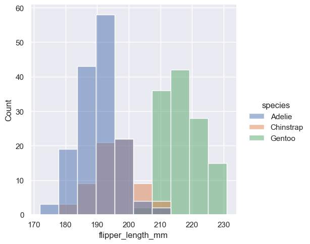
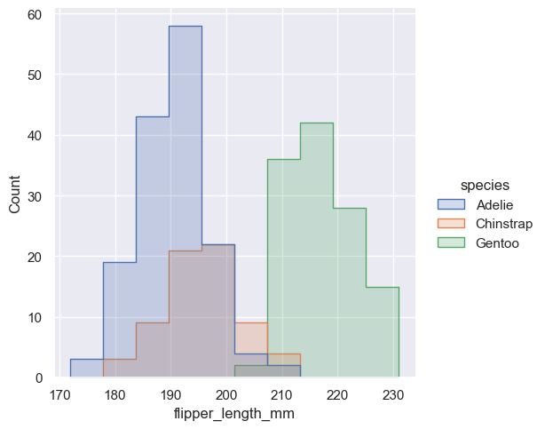
By default, the different histograms are “layered” on top of each other and, in some cases, they may be difficult to distinguish. One option is to change the visual representation of the histogram from a bar plot to a “step” plot:
sns.displot(penguins, x="flipper_length_mm", hue="species", element="step")
<seaborn.axisgrid.FacetGrid at 0x1ec184ce750>
Alternatively, instead of layering each bar, they can be “stacked”, or moved vertically. In this plot, the outline of the full histogram will match the plot with only a single variable:
sns.displot(penguins, x="flipper_length_mm", hue="species", multiple="stack")
C:\Users\schatzm\Anaconda3\envs\ju-book\Lib\site-packages\seaborn\distributions.py:254: FutureWarning: In a future version, `df.iloc[:, i] = newvals` will attempt to set the values inplace instead of always setting a new array. To retain the old behavior, use either `df[df.columns[i]] = newvals` or, if columns are non-unique, `df.isetitem(i, newvals)`
  baselines.iloc[:, cols] = (curves
<seaborn.axisgrid.FacetGrid at 0x1ec1b9cc410>
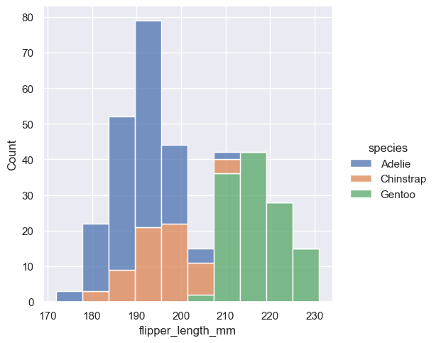
The stacked histogram emphasizes the part-whole relationship between the variables, but it can obscure other features (for example, it is difficult to determine the mode of the Adelie distribution. Another option is “dodge” the bars, which moves them horizontally and reduces their width. This ensures that there are no overlaps and that the bars remain comparable in terms of height. But it only works well when the categorical variable has a small number of levels:
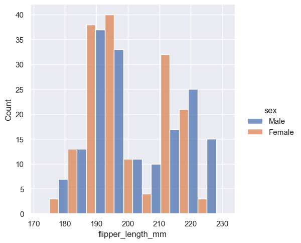
sns.displot(penguins, x="flipper_length_mm", hue="sex", multiple="dodge")
<seaborn.axisgrid.FacetGrid at 0x1ec1b984410>
Because :func:displot is a figure-level function and is drawn onto a :class:FacetGrid, it is also possible to draw each individual distribution in a separate subplot by assigning the second variable to col or row rather than (or in addition to) hue. This represents the distribution of each subset well, but it makes it more difficult to draw direct comparisons:
sns.displot(penguins, x="flipper_length_mm", col="sex")
<seaborn.axisgrid.FacetGrid at 0x1ec1b94be50>
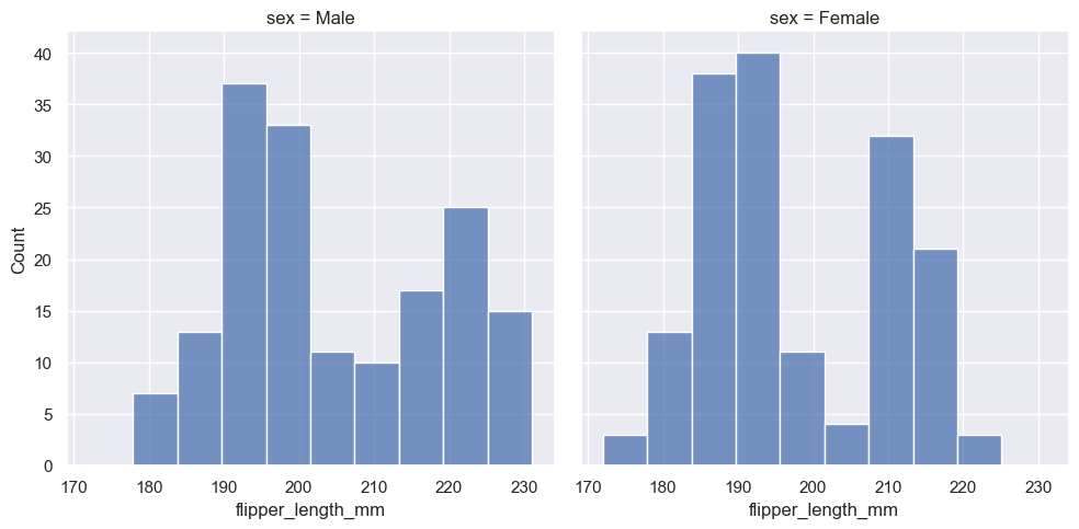
None of these approaches are perfect, and we will soon see some alternatives to a histogram that are better-suited to the task of comparison.
Normalized histogram statistics#
Before we do, another point to note is that, when the subsets have unequal numbers of observations, comparing their distributions in terms of counts may not be ideal. One solution is to normalize the counts using the stat parameter:
sns.displot(penguins, x="flipper_length_mm", hue="species", stat="density")
<seaborn.axisgrid.FacetGrid at 0x1ec1baea550>
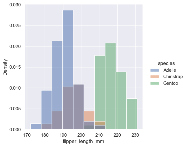
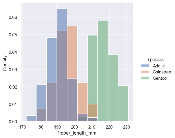
By default, however, the normalization is applied to the entire distribution, so this simply rescales the height of the bars. By setting common_norm=False, each subset will be normalized independently:
sns.displot(penguins, x="flipper_length_mm", hue="species", stat="density", common_norm=False)
<seaborn.axisgrid.FacetGrid at 0x1ec1c0fa890>
Density normalization scales the bars so that their areas sum to 1. As a result, the density axis is not directly interpretable. Another option is to normalize the bars to that their heights sum to 1. This makes most sense when the variable is discrete, but it is an option for all histograms:
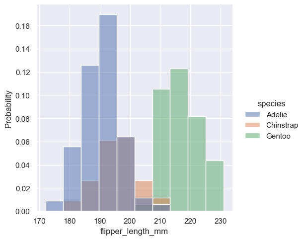
sns.displot(penguins, x="flipper_length_mm", hue="species", stat="probability")
<seaborn.axisgrid.FacetGrid at 0x1ec1beaa510>
Kernel density estimation#
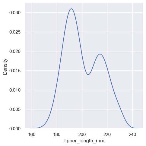
A histogram aims to approximate the underlying probability density function that generated the data by binning and counting observations. Kernel density estimation (KDE) presents a different solution to the same problem. Rather than using discrete bins, a KDE plot smooths the observations with a Gaussian kernel, producing a continuous density estimate:
sns.displot(penguins, x="flipper_length_mm", kind="kde")
<seaborn.axisgrid.FacetGrid at 0x1ec1c6b4410>
Choosing the smoothing bandwidth#
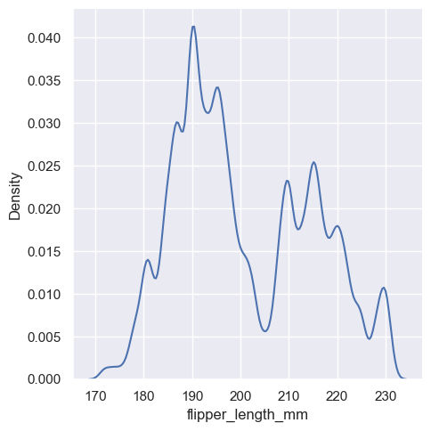
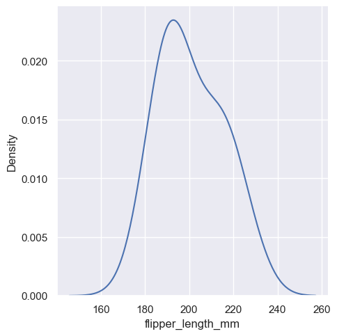
Much like with the bin size in the histogram, the ability of the KDE to accurately represent the data depends on the choice of smoothing bandwidth. An over-smoothed estimate might erase meaningful features, but an under-smoothed estimate can obscure the true shape within random noise. The easiest way to check the robustness of the estimate is to adjust the default bandwidth:
sns.displot(penguins, x="flipper_length_mm", kind="kde", bw_adjust=.25)
<seaborn.axisgrid.FacetGrid at 0x1ec1c0c2f10>
sns.displot(penguins, x="flipper_length_mm", kind="kde", bw_adjust=2)
<seaborn.axisgrid.FacetGrid at 0x1ec1c792290>
Conditioning on other variables#
As with histograms, if you assign a hue variable, a separate density estimate will be computed for each level of that variable:
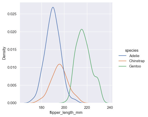
sns.displot(penguins, x="flipper_length_mm", hue="species", kind="kde")
<seaborn.axisgrid.FacetGrid at 0x1ec1c85fe90>
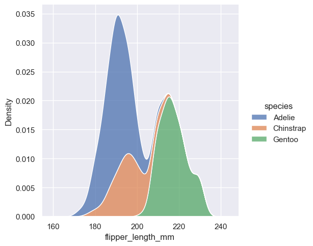
sns.displot(penguins, x="flipper_length_mm", hue="species", kind="kde", multiple="stack")
<seaborn.axisgrid.FacetGrid at 0x1ec1c7ae2d0>
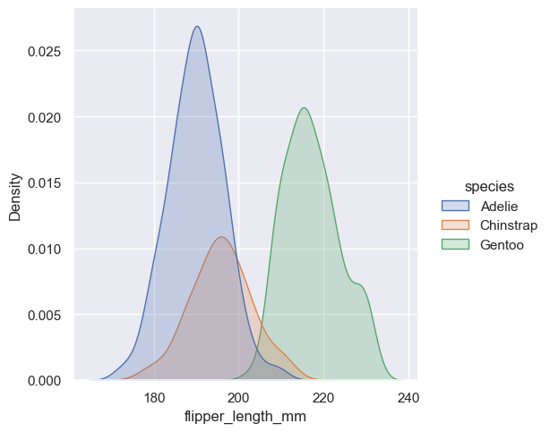
sns.displot(penguins, x="flipper_length_mm", hue="species", kind="kde", fill=True)
<seaborn.axisgrid.FacetGrid at 0x1ec1be3be50>
Kernel density estimation pitfalls#
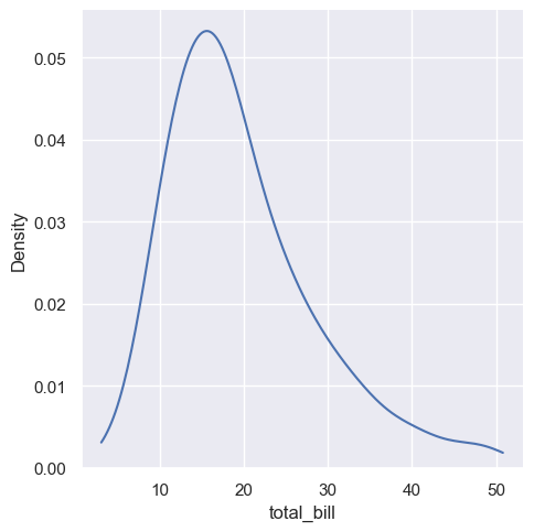
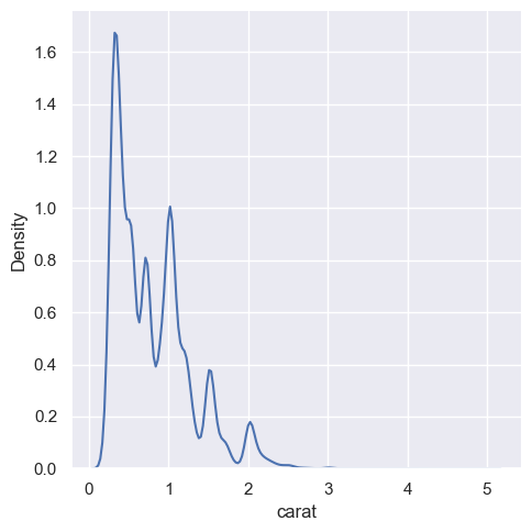
KDE plots have many advantages. Important features of the data are easy to discern (central tendency, bimodality, skew), and they afford easy comparisons between subsets. But there are also situations where KDE poorly represents the underlying data. This is because the logic of KDE assumes that the underlying distribution is smooth and unbounded. One way this assumption can fail is when a variable reflects a quantity that is naturally bounded. If there are observations lying close to the bound (for example, small values of a variable that cannot be negative), the KDE curve may extend to unrealistic values:
sns.displot(tips, x="total_bill", kind="kde")
<seaborn.axisgrid.FacetGrid at 0x1ec1fdbe890>
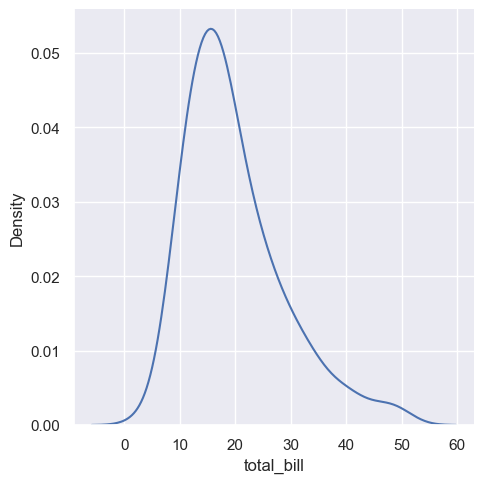
sns.displot(tips, x="total_bill", kind="kde", cut=0)
<seaborn.axisgrid.FacetGrid at 0x1ec2017ff50>
diamonds = sns.load_dataset("diamonds")
sns.displot(diamonds, x="carat", kind="kde")
<seaborn.axisgrid.FacetGrid at 0x1ec1c7b6390>
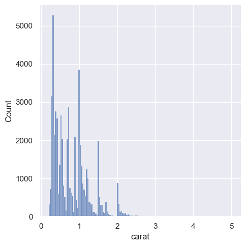
sns.displot(diamonds, x="carat")
<seaborn.axisgrid.FacetGrid at 0x1ec1fe35b90>
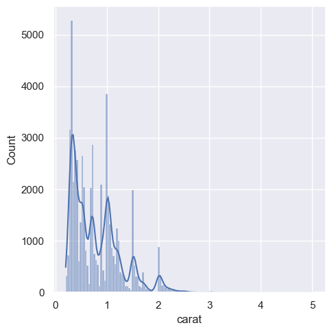
sns.displot(diamonds, x="carat", kde=True)
<seaborn.axisgrid.FacetGrid at 0x1ec215b5190>
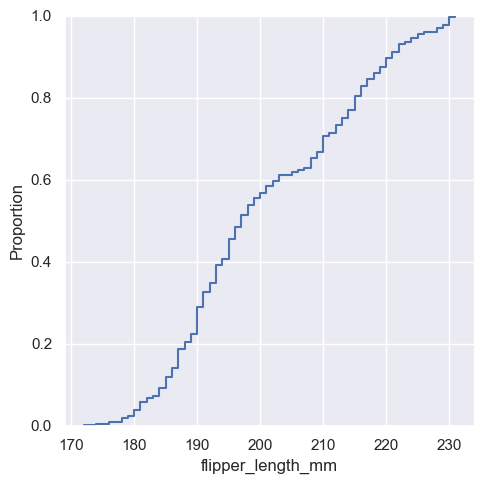
Empirical cumulative distributions#
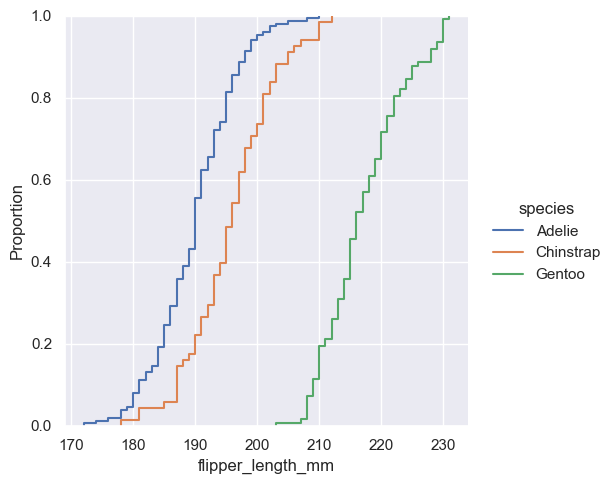
A third option for visualizing distributions computes the “empirical cumulative distribution function” (ECDF). This plot draws a monotonically-increasing curve through each datapoint such that the height of the curve reflects the proportion of observations with a smaller value:
sns.displot(penguins, x="flipper_length_mm", kind="ecdf")
<seaborn.axisgrid.FacetGrid at 0x1ec2012e9d0>
sns.displot(penguins, x="flipper_length_mm", hue="species", kind="ecdf")
<seaborn.axisgrid.FacetGrid at 0x1ec22b30d50>
Visualizing bivariate distributions#
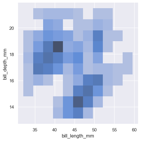
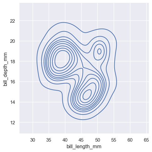
All of the examples so far have considered univariate distributions: distributions of a single variable, perhaps conditional on a second variable assigned to hue. Assigning a second variable to y, however, will plot a bivariate distribution:
sns.displot(penguins, x="bill_length_mm", y="bill_depth_mm")
<seaborn.axisgrid.FacetGrid at 0x1ec22bb6610>
sns.displot(penguins, x="bill_length_mm", y="bill_depth_mm", kind="kde")
<seaborn.axisgrid.FacetGrid at 0x1ec22e28b50>
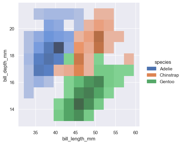
sns.displot(penguins, x="bill_length_mm", y="bill_depth_mm", hue="species")
<seaborn.axisgrid.FacetGrid at 0x1ec217eabd0>
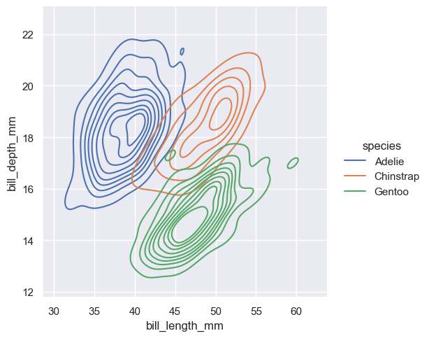
sns.displot(penguins, x="bill_length_mm", y="bill_depth_mm", hue="species", kind="kde")
<seaborn.axisgrid.FacetGrid at 0x1ec22b94c90>
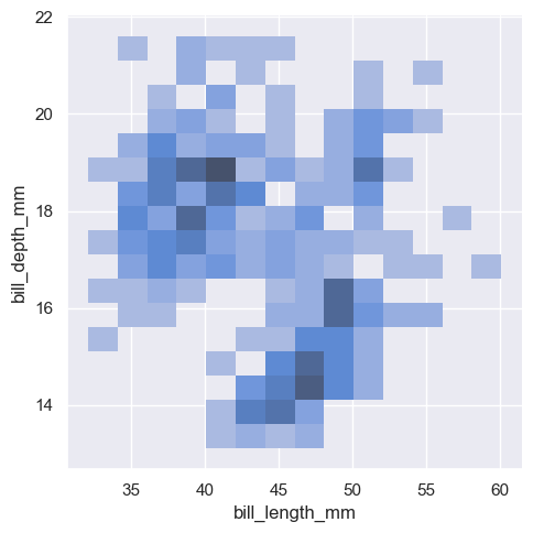
sns.displot(penguins, x="bill_length_mm", y="bill_depth_mm", binwidth=(2, .5))
<seaborn.axisgrid.FacetGrid at 0x1ec22edcf10>
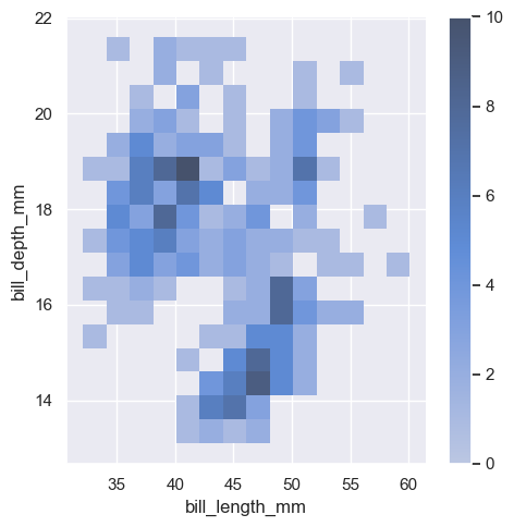
sns.displot(penguins, x="bill_length_mm", y="bill_depth_mm", binwidth=(2, .5), cbar=True)
<seaborn.axisgrid.FacetGrid at 0x1ec1c793750>
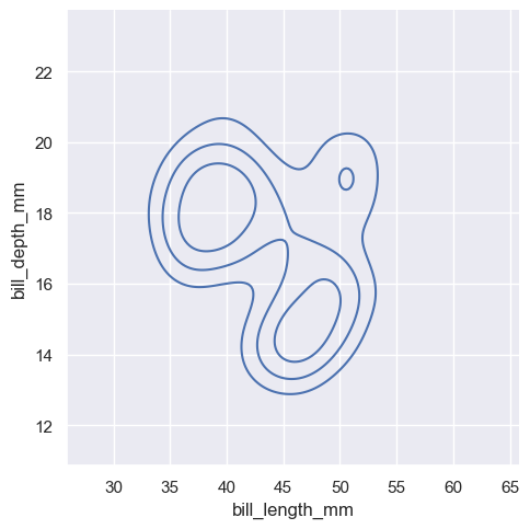
sns.displot(penguins, x="bill_length_mm", y="bill_depth_mm", kind="kde", thresh=.2, levels=4)
<seaborn.axisgrid.FacetGrid at 0x1ec230a4f10>
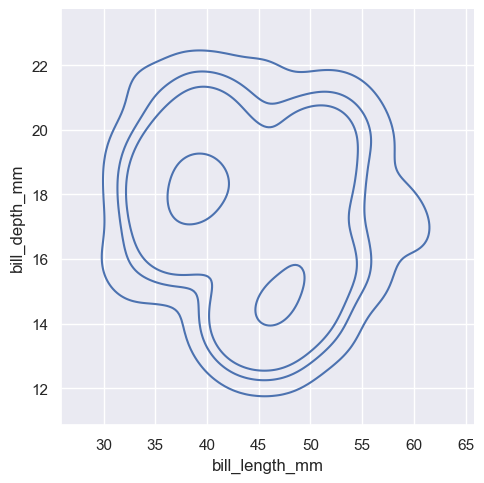
sns.displot(penguins, x="bill_length_mm", y="bill_depth_mm", kind="kde", levels=[.01, .05, .1, .8])
<seaborn.axisgrid.FacetGrid at 0x1ec23460b50>
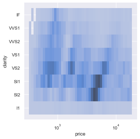
sns.displot(diamonds, x="price", y="clarity", log_scale=(True, False))
<seaborn.axisgrid.FacetGrid at 0x1ec231d4390>
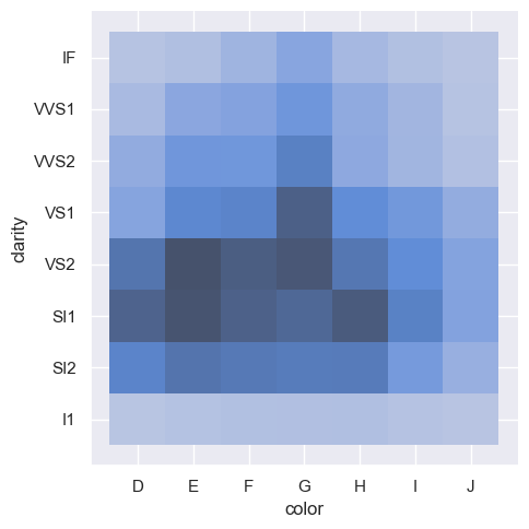
sns.displot(diamonds, x="color", y="clarity")
<seaborn.axisgrid.FacetGrid at 0x1ec231d5090>
Distribution visualization in other settings#
Several other figure-level plotting functions in seaborn make use of the :func:histplot and :func:kdeplot functions.
Plotting joint and marginal distributions#
The first is :func:jointplot, which augments a bivariate relatonal or distribution plot with the marginal distributions of the two variables. By default, :func:jointplot represents the bivariate distribution using :func:scatterplot and the marginal distributions using :func:histplot:
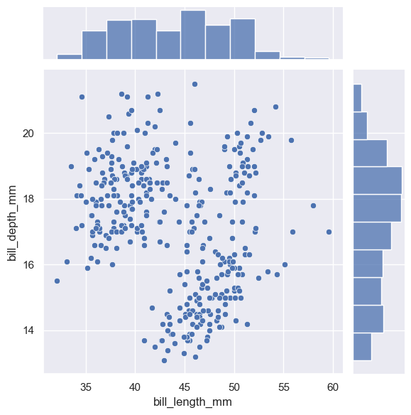
sns.jointplot(data=penguins, x="bill_length_mm", y="bill_depth_mm")
<seaborn.axisgrid.JointGrid at 0x1ec24c31950>
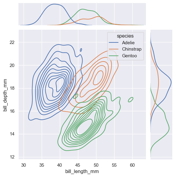
sns.jointplot(
    data=penguins,
    x="bill_length_mm", y="bill_depth_mm", hue="species",
    kind="kde"
)
<seaborn.axisgrid.JointGrid at 0x1ec234eb1d0>
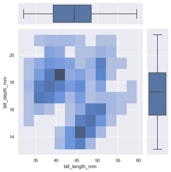
g = sns.JointGrid(data=penguins, x="bill_length_mm", y="bill_depth_mm")
g.plot_joint(sns.histplot)
g.plot_marginals(sns.boxplot)
<seaborn.axisgrid.JointGrid at 0x1ec235ca610>
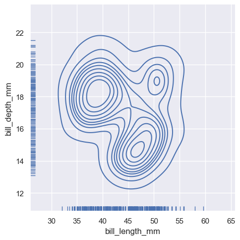
sns.displot(
    penguins, x="bill_length_mm", y="bill_depth_mm",
    kind="kde", rug=True
)
<seaborn.axisgrid.FacetGrid at 0x1ec26203650>
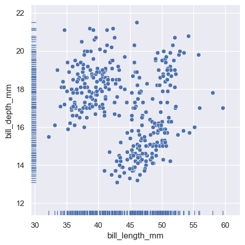
And the axes-level :func:rugplot function can be used to add rugs on the side of any other kind of plot:
sns.relplot(data=penguins, x="bill_length_mm", y="bill_depth_mm")
sns.rugplot(data=penguins, x="bill_length_mm", y="bill_depth_mm")
<AxesSubplot: xlabel='bill_length_mm', ylabel='bill_depth_mm'>
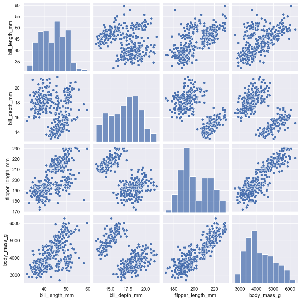
Plotting many distributions#
The :func:pairplot function offers a similar blend of joint and marginal distributions. Rather than focusing on a single relationship, however, :func:pairplot uses a “small-multiple” approach to visualize the univariate distribution of all variables in a dataset along with all of their pairwise relationships:
sns.pairplot(penguins)
<seaborn.axisgrid.PairGrid at 0x1ec262cd4d0>
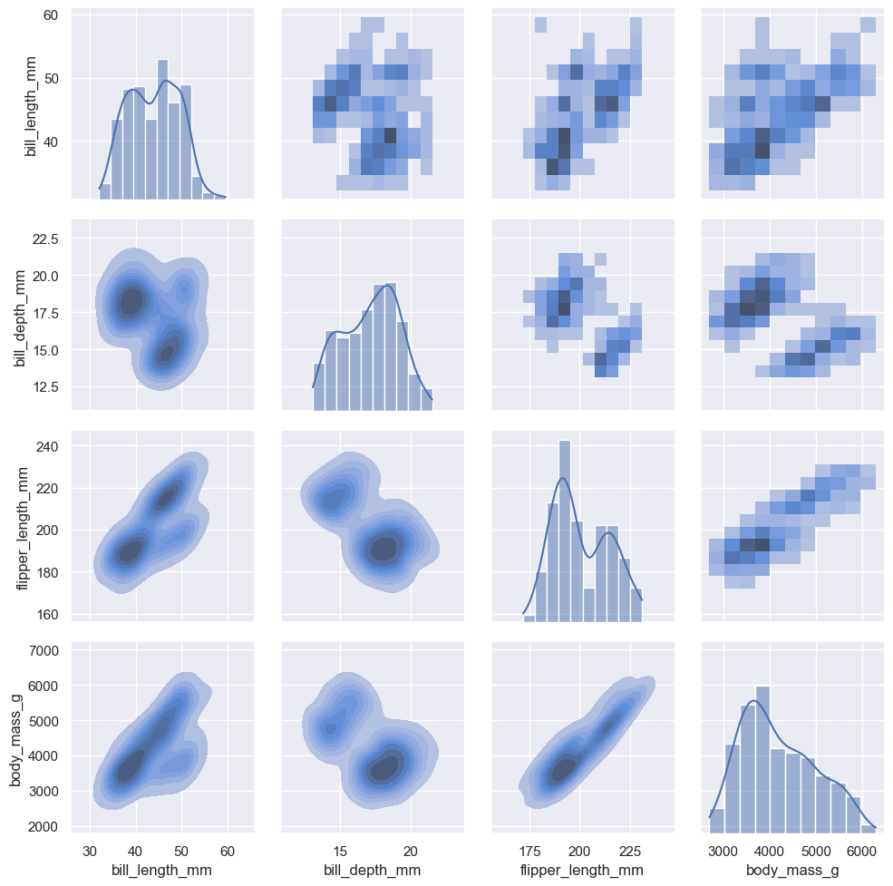
As with :func:jointplot/:class:JointGrid, using the underlying :class:PairGrid directly will afford more flexibility with only a bit more typing:
g = sns.PairGrid(penguins)
g.map_upper(sns.histplot)
g.map_lower(sns.kdeplot, fill=True)
g.map_diag(sns.histplot, kde=True)
<seaborn.axisgrid.PairGrid at 0x1ec27494ad0>
from watermark import watermark
watermark(iversions=True, globals_=globals())
print(watermark())
print(watermark(packages="watermark,numpy,pandas,matplotlib,bokeh,altair,plotly"))
Last updated: 2023-01-11T14:57:01.316394+01:00

Python implementation: CPython
Python version       : 3.11.0
IPython version      : 8.8.0

Compiler    : MSC v.1929 64 bit (AMD64)
OS          : Windows
Release     : 10
Machine     : AMD64
Processor   : Intel64 Family 6 Model 85 Stepping 7, GenuineIntel
CPU cores   : 40
Architecture: 64bit
watermark : 2.3.1
numpy     : 1.24.1
pandas    : 1.5.2
matplotlib: 3.6.2
bokeh     : 3.0.3
altair    : 4.2.0
plotly    : 5.11.0